
A UX Approach to Student Housing: 0 to 1 Design
Context
Our team tackled our project based on the following prompt:
Finding affordable, safe, and convenient off-campus housing can be a significant challenge for college students, especially those new to a city or university.
⚙️ How might we create an online platform that connects students with verified housing options, provides rental guidance, and facilitates informed housing decisions?
Project Goals
Streamline Housing Search
Make finding roommates and rentals easy and efficient.
Offer Vetted Listings
Provide safe, reliable housing options.
Personalize Matches
Use quizzes for tailored roommate and property connections.
Empower with Information
Give students essential renting guidance in a simple format.

Approach
Preliminary Research
Key Strengths
- User-Intuitive Layout
- Comprehensive Information
Key Weaknesses
- Missing Leasing Dates
- Limited Communication Tools
Opportunities for Improvement
- FAQ Integration
Interviews
Our team conducted 12 interviews to get more specific insight into individual thoughts and processes when finding off campus housing. From these insights, we identified key needs like affordability, clarity, and social connection.
Pricing
Participants mentioned affordability as a major challenge in finding housing.
Proximity
Surveyors stated proximity to campus as a deciding factor.
Application Type
Surveyors preferred using desktop websites for housing searches.
Discovery
Surveyors stated they often find housing opportunities through social sites/forums or word of mouth.
Synthesis & Ideation
My Role
During our team meeting, I facilitated a collaborative walkthrough of both our quantitative data and our insights from user interviews and observational research.
Affinity Mapping
Insights that reflected shared student needs and frustrations. These findings directly shaped our feature prioritization and content strategy. We identified five core focus areas: pricing, accessibility, comparability, transparency, and community.

The Uncertain Student Persona
Based off data from both surveys, interviews, and affinity mapping we developed personas of our target users: 2nd to 4th year students looking to find off capus housing with little to no knowledge on renting.


Lo-Fi Sketches
I facilitated a sketching session where each team member ideated wireframes based on our user insights. This collaborative process shaped our first draft of the content structure and possible features.

User Flows
During the pre-prototyping stage, we started with a user flow to be clear of the journey each user would be taking and to define the core tasks and interactions users would complete within each page.

Mid-Fi Prototyping
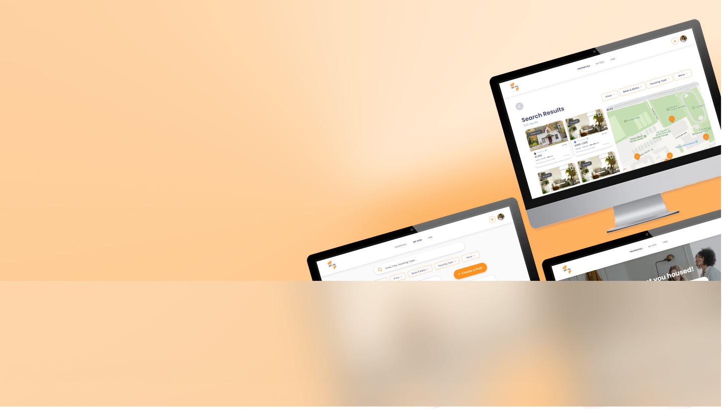
Our initial wireframes included 4 pages all addressing different aspects of our data. The Home and Listings page serves as a hub for browsing tailored listings and contacting landlords, while the Explore page fosters community through shared posts and roommate connections. The Create a Post form streamlines contributions with photos and details, making the housing search both intuitive and collaborative.

User Testing
We conducted user testing on our mid-fidelity prototype with 5 participants and found these to be the most apparent pain points:
The Good
Direct landlord access: Simplified communication with verified property owners.
Localized student networking: Easy connection with local peers for shared housing needs, fostering community engagement.
The Bad
Poor CTA Placement: The “Post a Listing” button felt intrusive and unclear.
Underplayed Social Element: Our unique value, student social interaction, wasn’t initially front and center.
User-Informed Adjustments
Clearer Structure: Renaming “Explore” → “My Feed” and “Home” → “Properties” improved clarity.
Stronger Focus: Making My Feed the homepage highlighted our platform’s unique social features.
Feedback directly shaped layout and content changes.
Design Standards & Branding


